The beauty of the Juicer social media aggregator is it’s built with your brand in mind. With 9 feed styles and open color and design options to choose from, the possibilities are endless!
We know that with great choices comes great responsibility to your brand, so we’ve developed a guide to break down each of our social media feed styles to help you better determine which is the best selection for your brand. Whether the brand in question is old school, modern, playful, or serious, the Juicer aggregator can fit your needs. Read on to discover what sets each social media feed style apart.
Social Media Feed Style: Modern
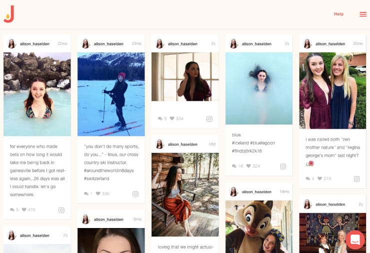
The Modern social media feed style is a perfect match for brands that aim to be light, airy, modern, and fresh! The white header and footers keep the focus on your content while also offering a playful hint at the caption, likes, comments, and your account handle. For brands looking to truly mirror the effect of scrolling through posts on the actual social media app, the Modern social media feed option fits the bill. One of the best features of this style is that it effortlessly evolves as your brand does. So fear not the wrath of website revamps and brand guideline pivots, the Modern style has you covered.
This style might be right for you if your brand:
– Uses modern color palettes (creams, pastels, simple bases with bold accent colors)
– Wants to mimic the look of being on a social media app
– Wants to show off image captions
– Defines itself as one of the following: bright and airy, boho-chic, modern, minimalistic, elegant, whimsical
Social Media Feed Style: Night
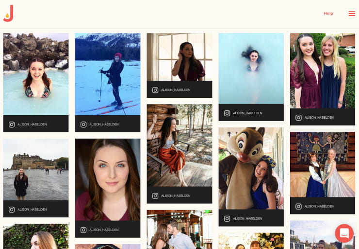
Is your brand itching to join the dark side? For our sleek and edgy brands, we suggest trying the Night social media feed style. This customization is classy and chic but still gets the job done. Your social media handles and an icon dictating from which platform the post has been aggregated are displayed at the bottom of each post. This is a great option for showing off your brand’s best content in a sophisticated manner!
This style might be right for you if your brand:
– Uses bold color palettes (bright colors, jewel tones, monochromatic themes)
– Wants to keep it simple
– Defines itself as one of the following: edgy, mysterious, classic, sleek, dark, intense, serious
Polaroid:
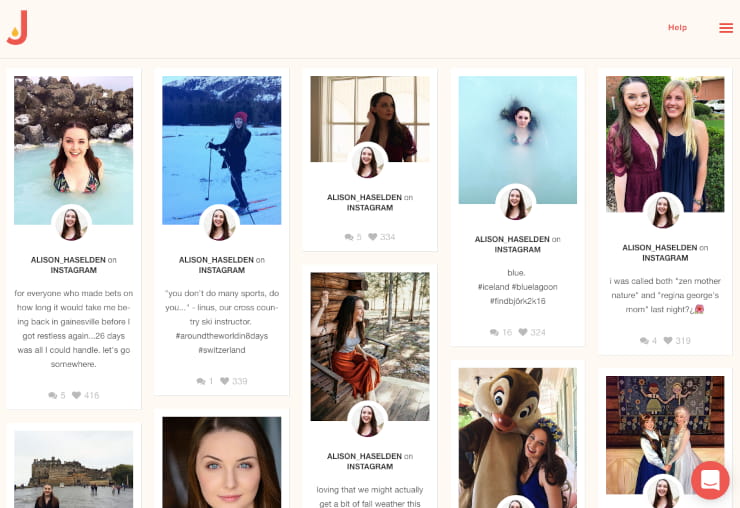
The Polaroid social media feed style is the perfect option for those will an old soul. This customization creates a personal feel that makes followers feel like they know you! It’s also an excellent option for brands wanting to provide users with more information about each post. The first few lines of captions will be displayed along with your username. Another bonus? A label listing the social media platform (Instagram, Facebook, Twitter, etc.) will also be shown so that users know exactly where they can engage with their favorite posts!
This style might be right for you if your brand:
– Uses vintage-inspired themes (pastels, primary colors, muted tones)
– Wants to showcase captions and profile images
– Defines itself as one of the following: charming, witty, light, old soul, fashionable, crafty, clever
Image Grid:

The Image Grid social media feed option is the first to deviate from the standard “imitation social media post” style. In this customization, posts are oriented in a pattern of multi-sized rectangles that creates a complimentary grid pattern. Looking for your captions? They’re still there, only hidden! The captions and additional information will appear when you hover your cursor over each social media post. Additionally, the Image Grid can be adjusted to meet your brand’s needs through the number of columns, height, and width.
This style might be right for you if your brand:
– Wants to showcase the brand’s colors, patterns, and gradients
– Likes clean lines without the clutter of captions
– Defines itself as one of the following: modern, people-oriented, multi-passionate, welcoming
Widget:
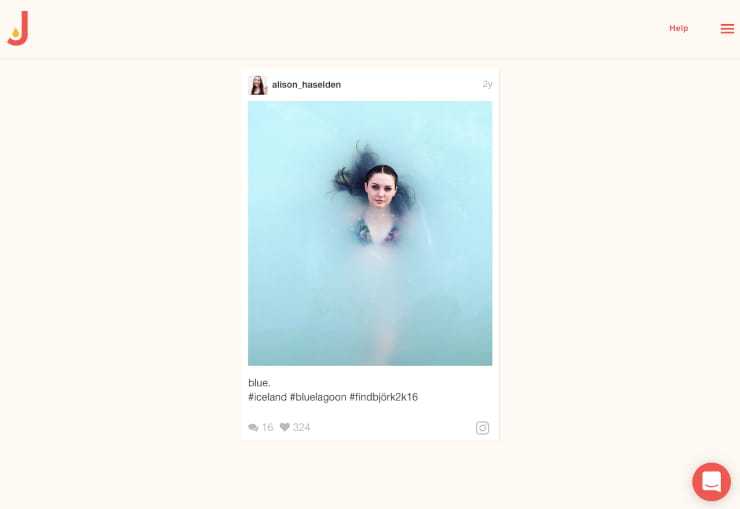
For those with limited space on their websites who still want to show off the power of their social media aggregator, we’d suggest trying the Widget social media feed style. In this customization, viewers are only revealed one social media post at a time. While this social media feed is in some ways more subtle, it actually draws the eye and demands viewers attention. Without a plethora of other social media posts visible to pull focus, the website visitors can view and appreciate fully each post as it appears. Our customization dashboard allows you complete control over how quickly the posts are cycled through, too! Click the image below to see an example of the Juicer social media feed widget in action:

This style might be right for you if your brand:
– Wants to showcase posts that are detailed, intricate, and powerful that need individual attention
– Only has a small space on their website to devote to a social media feed.
– Defines itself as one of the following: bold, artistic, detail-oriented, fashionable, cultural
Slider:
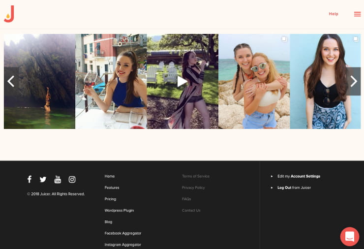
As the name suggests, this social media feed is structured in a style that blends seamlessly into nearly all websites – a slider! One of the unique aspects of this slider, however, is you can set the automatic timer to ensure your social media content is constantly on revolve. That way website visitors have the chance to see all of your best posts whether they opt to click on the arrows or not.
Click the image below to see an example of the Slider Juicer feed in action:
This style might be right for you if your brand:
– Has a designated section to share the social media feed, such as the bottom of a page.
– Wants to ensure that website visitors are seeing new social media posts every few seconds.
– Defines itself as one of the following: sleek, cutting-edge, simple, understated, classic
Hip:

Like the Image Grid style, the Hip social media feed is an excellent option for those looking to showcase their visual content in a seamless manner. Each post is nestled against the other, eliminating border lines, headers, and captions from initial view. This is one of the customization options that truly maximizes the screen-space and devotes every pixel to displaying your content. Keep in mind that while the posts will appear in unique sizes, the settings offer options to adjust the column number, widths, heights, and post orders to make your feed match your vision.
This style might be right for you if your brand:
– Wants to showcase the brand’s colors, patterns, and gradients
– Likes clean lines without the clutter of captions
– Defines itself as one of the following: modern, people-oriented, multi-passionate, welcoming
Living Wall:
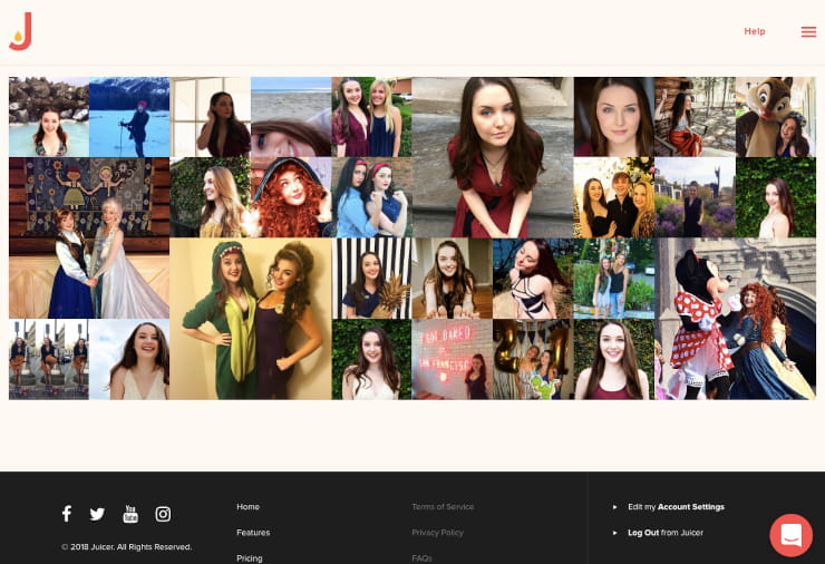
While it may look similar to our previous style, Hip, this social media feed comes with a special surprise. The Living Wall social media feed style option is the last of our three customizations with built-in, periodic movement. While the main grid shape will remain in place, each of the individual boxes featured will cycle through to reveal a new post. The resulting effect looks like a wall with built-in revolving pieces. Through our customization dashboard, you can select your preferred timing of the change. Click the image below to see an example of the Living Wall Juicer feed in action:
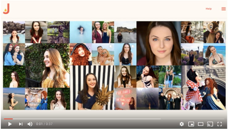
This style might be right for you if your brand:
– Wants to keep the Juicer social media feed isolated to a certain section of a website page.
– Wants to make it easy for website visitors to see many different social posts at once.
– Defines itself as one or more of the following: playful, whimsical, imaginative
There you have it, the full tour of Juicer’s eight unique social media feed customization styles. Whether you choose Modern, Hip, Slider, or Night your Juicer social media aggregator will collect and showcase your brand’s best content.
Feel free to test each of the feed styles and discover which works best for your brand. Once your shiny new social media feed is ready to go, let us know! We love seeing your Juicer feeds in action.
